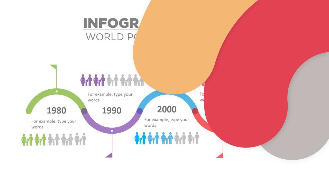
In today’s fast-paced world, where information is constantly bombarding us from all directions, the ability to effectively communicate ideas and concepts has become more critical than ever. With the rise of social media and digital platforms, visual storytelling has emerged as a powerful way to engage, captivate, and leave a lasting impression on our audiences. And at the forefront of this medium is the timeline infographic – a versatile tool that presents complex data in a visually appealing and easily digestible format.
In this comprehensive guide, we will delve deep into the world of timeline infographics, exploring why they matter, their key elements, design principles, best practices, and practical applications across various industries. So, strap in, and let’s navigate the river of time together.
Introduction to Timeline Infographics
Simply put, a timeline infographic is a visual representation of chronological events or processes. It uses images, icons, and other visual elements to convey a narrative or tell a story in a sequential format. They can range from simple linear timelines to more complex interactive ones that allow users to explore different events and details.
Timeline infographics have been around for centuries, with historical figures like Leonardo da Vinci and Isaac Newton using them to represent the progression of scientific discoveries and inventions. However, it was only when technology advanced in the late 20th century that timeline infographics gained widespread popularity, with the rise of graphic design software and digital media.
Today, these infographics are used in various contexts, including marketing, education, journalism, and data visualization. They are an excellent way to break down complex information into bite-sized chunks and make it more accessible to a broader audience.
Benefits of Using Timeline Infographics

As mentioned earlier, our brains are wired for visual processing, making timeline infographics an effective tool for communication. Here are some key benefits of using them:
Simplifying Complexity
One of the most significant advantages of timeline infographics is their ability to present complex information in a simplified and organized manner. By structuring events or processes chronologically, they make it easy for viewers to follow and understand even the most intricate details. This is particularly useful when dealing with historical or scientific data that may seem overwhelming when presented in traditional text-based formats.
Boosting Engagement
Visuals are more engaging than plain text, and timelines take this a step further by presenting information in a visually appealing and attractive way. This grabs the viewer’s attention and encourages them to explore the infographic at their own pace. With interactive elements, timelines provide an immersive experience, making viewers feel like they are part of the story.
Enhancing Memorability
Our brains process images faster and retain visual information better than text-based information. Timeline infographics leverage this by associating each event with a visual cue, making it more likely to stick in the viewer’s mind. This can be especially useful in educational settings where students need to remember historical dates or processes.
Establishing Context
Another significant advantage of timeline infographics is that they provide a structured narrative that showcases the flow of events and highlights essential connections between them. This allows viewers to gain a better understanding of the bigger picture and how each event fits into the overall story.
Key Elements of an Effective Timeline Infographic

To create a successful timeline infographic, certain key elements need to be considered. These include:
Chronology
The primary purpose of a timeline infographic is to showcase events or processes in chronological order. This means that the timeline should be organized from left to right, with earlier events on the left and later events on the right. This ensures that the information is easy to follow and understand.
Visual Hierarchy
The use of visual hierarchy is crucial in any design, and timeline infographics are no exception. The most critical events or information should be emphasized and given prominence, while supporting details can be presented using smaller text or images. This ensures that viewers focus on the most critical aspects of the timeline.
Consistent Design
A visually appealing timeline infographic requires consistency in design elements such as colors, fonts, and imagery. This creates a cohesive look and feel, making it easier for viewers to follow along and understand the information presented.
Balanced Layout
A well-designed timeline infographic needs to have a balanced layout, with enough white space to make it easy to read and navigate. Overcrowding the infographic with too much information or visual elements can make it overwhelming and challenging to comprehend. The use of grids and columns can help achieve a balanced layout.
Designing Visually Appealing Timelines
Creating a visually appealing timeline infographic requires careful consideration of design principles and techniques. Here are some tips to make your timelines stand out:
Choose a Theme
Before starting your design, you should choose a theme that aligns with the subject matter of your infographic. This could be based on the color scheme, font choices, or overall style. A cohesive theme ties all the elements together and makes the infographic more visually pleasing.
Use Appropriate Colors
Colors play a vital role in any design, and timeline infographics are no exception. Choose a color palette that is visually appealing, but also has meaning and significance behind it. For example, if creating a timeline about environmental disasters, using shades of green and blue can convey a sense of urgency and importance.
Incorporate Visual Cues
Visual cues, such as icons, images, and illustrations, help break up text blocks and add interest to the infographic. They also serve as visual representations of the information being presented, making it easier for viewers to understand and remember.
Utilize Data Visualization
Data visualization involves turning complex data into easy-to-understand visual representations. In timeline infographics, this can be achieved through the use of charts, graphs, and maps. This not only makes the information more engaging but also makes it easier to process and remember.
Tools and Software for Creating Timeline Infographics
There are various tools and software available that make creating timeline infographics relatively easy, even for those with minimal design experience. Here are some popular options:
Canva
Canva is a user-friendly graphic design platform that offers a wide range of templates, including timeline infographics. It has an intuitive drag-and-drop interface, making it easy to add and edit images, text, and other design elements. Canva also offers a vast library of icons and illustrations to choose from.
Visme
Visme is an all-in-one visual content creation tool that allows users to create interactive and animated timeline infographics. It has a library of pre-designed templates, as well as a vast collection of visuals, icons, and data visualization tools.
Adobe Illustrator
Adobe Illustrator is a professional-level vector graphics editor that offers robust features for creating intricate and detailed timeline infographics. It has a steeper learning curve than other tools, but its capabilities make it a favorite among designers.
Infogram
Infogram is a web-based infographic design tool that offers a simple drag-and-drop interface. It has a variety of pre-designed templates, data visualization tools, and integration options, making it a suitable choice for businesses and marketers.
Best Practices for User Engagement
Creating a visually appealing timeline infographic is only half the battle; the other half is ensuring that it engages and captivates the audience. Here are some best practices to keep in mind to enhance user engagement:
Keep It Simple
The key to a successful timeline infographic is simplicity. Avoid overloading the infographic with too much information or unnecessary visuals. Stick to the most important events and details, and present them in a way that is easy to understand and follow.
Add Interactivity
Interactive elements, such as clickable icons or animations, can make the timeline more engaging and allow viewers to explore the information at their own pace. This also makes the infographic more memorable and encourages users to spend more time interacting with it.
Incorporate Storytelling
Humans are natural storytellers, and incorporating storytelling techniques into your timeline infographic can make it more engaging and memorable. Use a narrative structure to guide viewers through the timeline, and add compelling visuals and descriptions to bring the story to life.
Keep It Relevant
When creating a timeline infographic, it’s essential to keep the content relevant to the target audience. Make sure the events or processes included are of interest to your audience and presented in a way that is relatable to them.
Case Studies of Successful Timeline Infographics
To further understand the impact of timeline infographics, let’s take a look at some real-life examples from various industries:
The Evolution of the Web (Google Data Arts Team)
This interactive timeline infographic takes viewers on a journey through the history of the internet, starting from its inception in 1991 to the present day. By using a simple, yet visually appealing design, this infographic engages users and highlights the significant milestones in the evolution of the web.
A Visual History of Nobel Prize Winners (Nestpick)
This timeline infographic presents the data on Nobel Prize winners from 1901 to 2018 in an intuitive and visually appealing format. It allows users to filter the data by country, gender, and prize category, making it easy to explore and understand the trends and patterns.
Evolution of Video Game Controllers (Pop Chart Lab)
This infographic showcases the evolution of video game controllers from the first joystick in 1972 to modern-day consoles. The design is visually stunning and utilizes a consistent color scheme and layout, making it easy to follow and compare the different controllers.
Common Mistakes to Avoid
While timeline infographics can be a powerful tool for communication, there are some common mistakes that designers should avoid:
Cluttered Design
One of the most significant mistakes in timeline infographic design is overcrowding it with too much information or visuals. This can make the infographic overwhelming and challenging to read and understand.
Inaccurate Data
Inaccurate or incorrect data can severely impact the credibility of your timeline infographic. Make sure to fact-check all the information before including it in the design.
Poor Visual Hierarchy
An effective visual hierarchy is crucial in any design, and timelines are no exception. Make sure to use font sizes, colors, and design elements to highlight key events and details.
Future Trends in Interactive Timeline Infographics
As technology continues to advance, we can expect to see more engaging and interactive timeline infographics. Here are some potential future trends:
Virtual and Augmented Reality
Virtual and augmented reality technologies have the potential to revolutionize how we interact with information. In the future, we may see timeline infographics incorporating these technologies to create immersive experiences for users.
Infographics on Social Media
With the increasing popularity of social media platforms, we can expect to see more timeline infographics being shared on these platforms. As users’ attention spans continue to decrease, short and visually appealing infographics will become the go-to format for content creators.
Conclusion
Timeline infographics are a powerful tool for communicating complex information in a visually appealing and easily understandable way. By leveraging the power of visual storytelling, designers can engage, captivate, and leave a lasting impression on their audiences. With the right design principles, tools, and best practices, timeline infographics have the potential to become even more impactful in the future. So why not take the plunge and start creating your own timeline infographics today?

